
As you might have noticed, we have had a wee bit of a redesign here at Lost in the Cloud. But how you would have noticed, I am not sure, since any visits to this blog in the last year or two will have proven generally underwhelming (even more underwhelming than when we post more often). Thanks to Greg’s posts John Stump, composer of Faerie’s Aire and Death Waltz and Moby Books Illustrated Classic Editions (both published in 2010), we still receive between 100 and 200 views on any given day. But those views are the result of a couple of brilliant niche subjects and not the steady traffic that results from consistent and thoughtful blogging, the initial challenge we set for ourselves here at LITC.
Granted, Greg and I are quite busy with work and life in general, but this is my formal recommitment to Lost in the Cloud and the first order of business was the redesign. It seems like the last design update was only a few months ago, but looking back at my records I realised that the blog hasn’t had any design changes since September 2011, which, in graphic design terms, is ancient.
I’ve always aimed to make the aesthetic of the blog efficient, playful and thoughtful. Those values played a significant part in the inspiration for my original ‘yod cloud’ design back in 2004. Since those initial doodles I have employed the wee cloud in a large number of designs, including this painting with the full Tetragrammaton, the Hebrew name of God (יהוה or YHWH) which was commissioned for a church in 2006:
 oil on maple, 4′ x 5′, commissioned for Grace Brethren Church of Long Beach
Later on in 2006 I was part of a mix CD club with Greg and some friends and for my round I decided to make a mix that was a playful reflection on the mythical history presented in the Christian Bible called Die Geschichte (The Recapitulation). This was when I discovered the versatility of the yod cloud design:
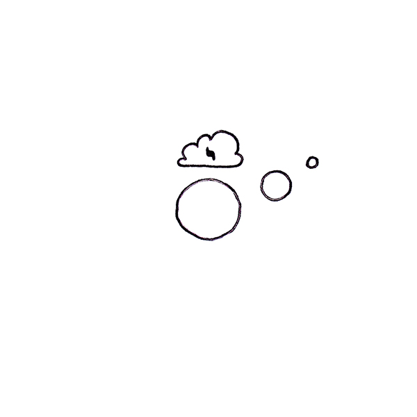 I. The Creation
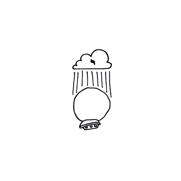 IV. The Flood
 VI. The Exodus & the Wilderness
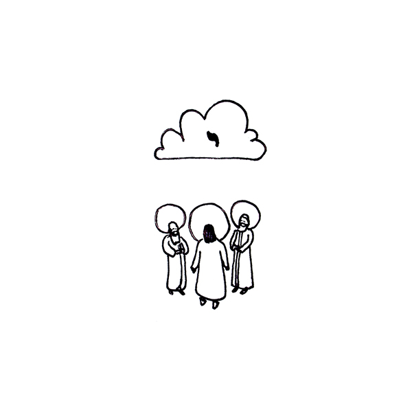 XII. The Life of Christ – The Transfiguration
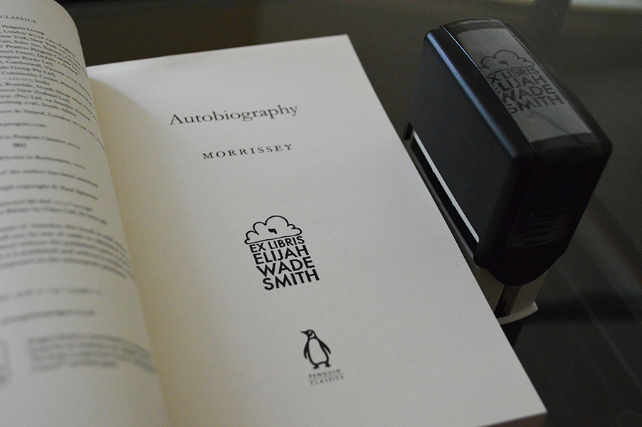
The playfulness of the design is made quite obvious in these illustrations and it was this yod cloud in the Transfiguration that most captured my imagination. I began to use it obsessively. I even designed a book stamp featuring it:
In 2007 I devised and led an art project made up of a group of university friends that formed a small orchestra and theatre/dance group and performed a theatrical and orchestral version of Sufjan Stevens’ ‘The Transfiguration’ at Biola University in La Mirada, California. The programmes featured the illustration from the Transfiguration above:

The iconic clouds played a very prominent role in the performance, adorning dancers as well as musicians. So two years later, when Greg and I were first inspired to start our own blog the name, taken directly from the coda of the song above, came rather quickly, and the yod cloud was sure to be a design feature. So here’s a wee walk-through of the header designs we’ve employed in the last four years.
Our first header was rather simple, featuring the yod cloud prominently:

As with many of my designs, looking at it now I see it as cluttered, boring and lazy, but I think we really liked it at the time. The second design was introduced in November 2010 and was nearly identical, but with a few changes:

One cloud was added and each cloud employed finer lines, which tidied up the look a wee bit. Also, the text was brought out to the foreground. Nothing too major until July 2011, when the third overhaul took place:

For some reason I went back to my early design days and employed a whole lot of drop shadow and opacity. Making two dimensional designs ‘appear’ to have three dimensions was all the rage. Not long after this design I realised that the white background was looking very boring, so in September 2011 I added the sea foam hue:

I would consider this a definite improvement, but it frightens me that I went more than two years without altering the design. That is a reflection of how much (or how little) attention I’ve paid to Lost in the Cloud, and for that I apologise (although I suspect that most folk pay no attention to the design and those that do probably never thought of our blog’s aesthetic as much to look at).
This leads me to the current design:

The Andersonian echoes should be screaming at you (though I assure you, it was subconscious). I’ve decided to really shake it all up. The hallmark yod cloud is there, but I’ve actually finally tailored it into a nice, clean, geometric design. The hand-drawn element of the previous designs had its own charm, but I’m in the mood for this streamlined cloud. Flanking the redesigned cloud are navigatory motifs (left) and cloudy-scientific motifs (right). And yes, I think I just invented the word ‘navigatory’, but I’m pretty sure you know what I mean. We’ve got the text in a cleaner, modern typeface (the old stenciled typeface was really getting on my visual nerves) that stretches across the whole of the header and below it you may notice nine wee symbols. These are actually international weather office map code for describing different types of high clouds. Along with ditching multiple clouds and the old typeface, I also flattened everything. I think this might be related to the rekindling of my love for printed media and classic branding (see a series of redesigns of professional Scottish football badges I attempted over the last five months).
If you have stuck it through and are still reading this post, let me both apologise for my self indulgence and extend a hearty thank you to you! Greg and I are back to post more regularly and we hope it’s as exciting for you, our readers, as it is for us. And maybe I’ll finally get around to manufacturing some merchandise (like this yod cloud badge) for those eager to rep LITC…


